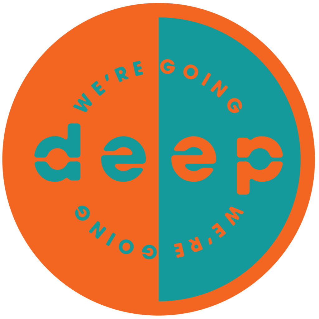
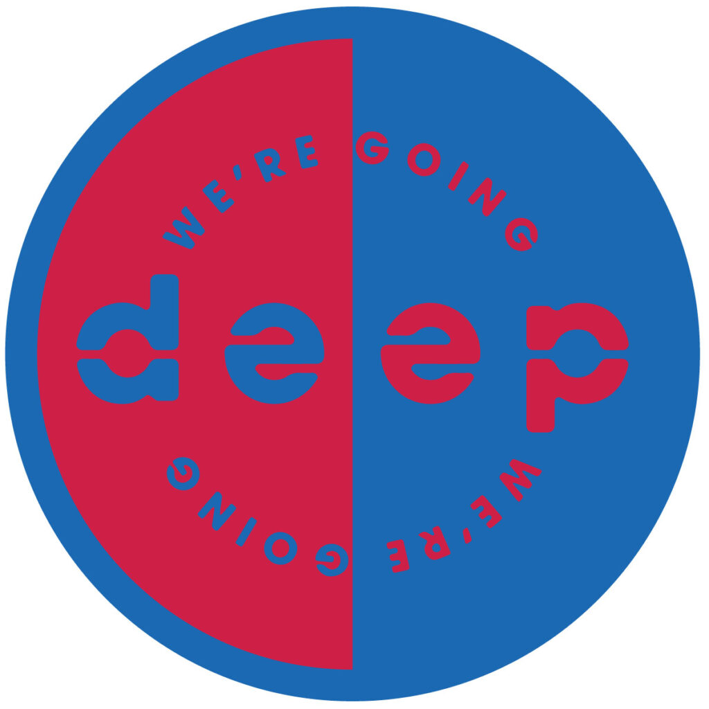
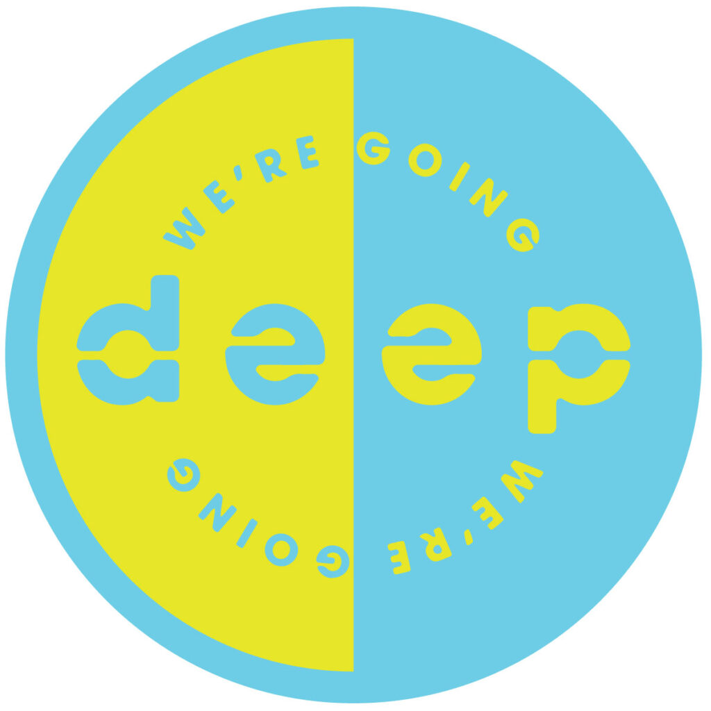
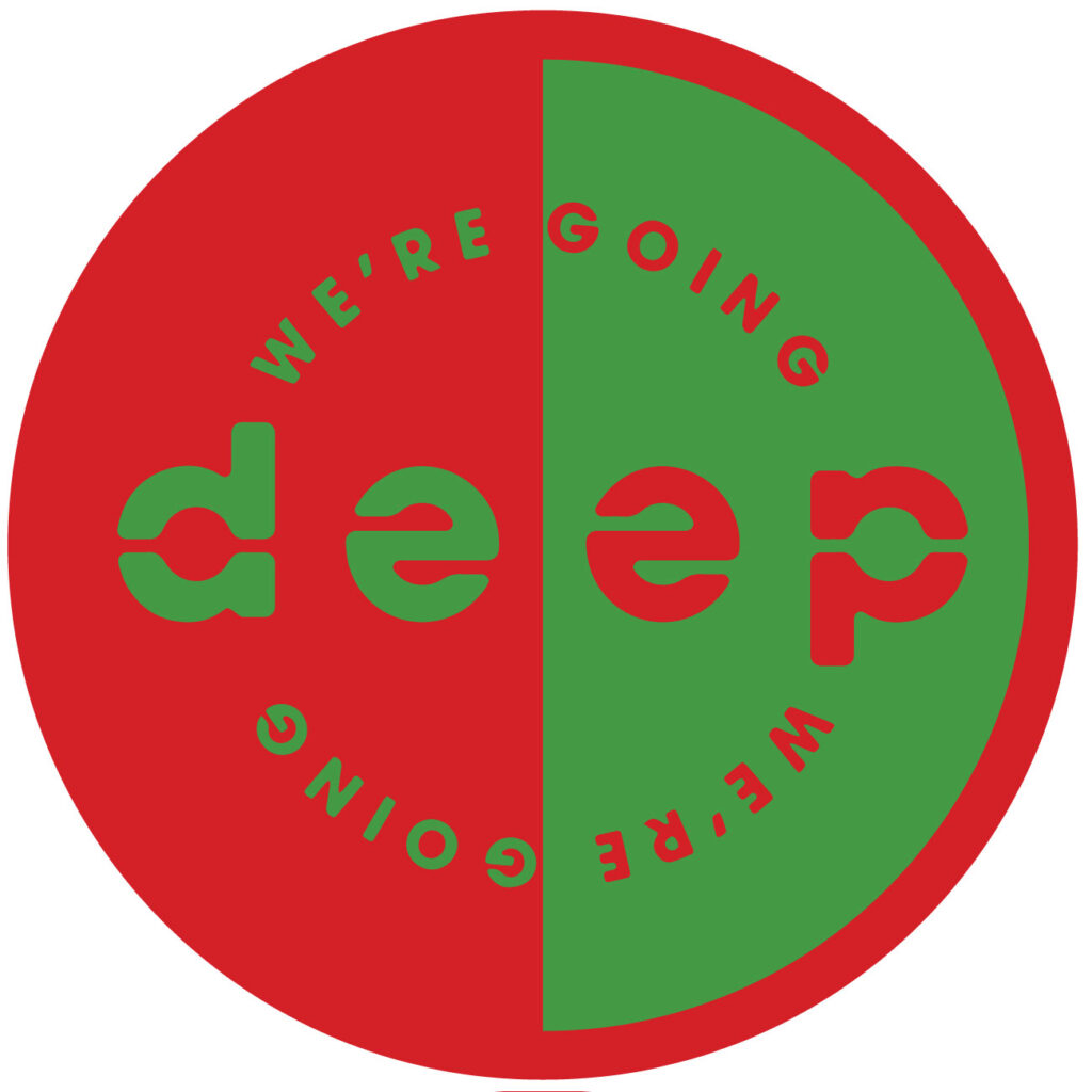
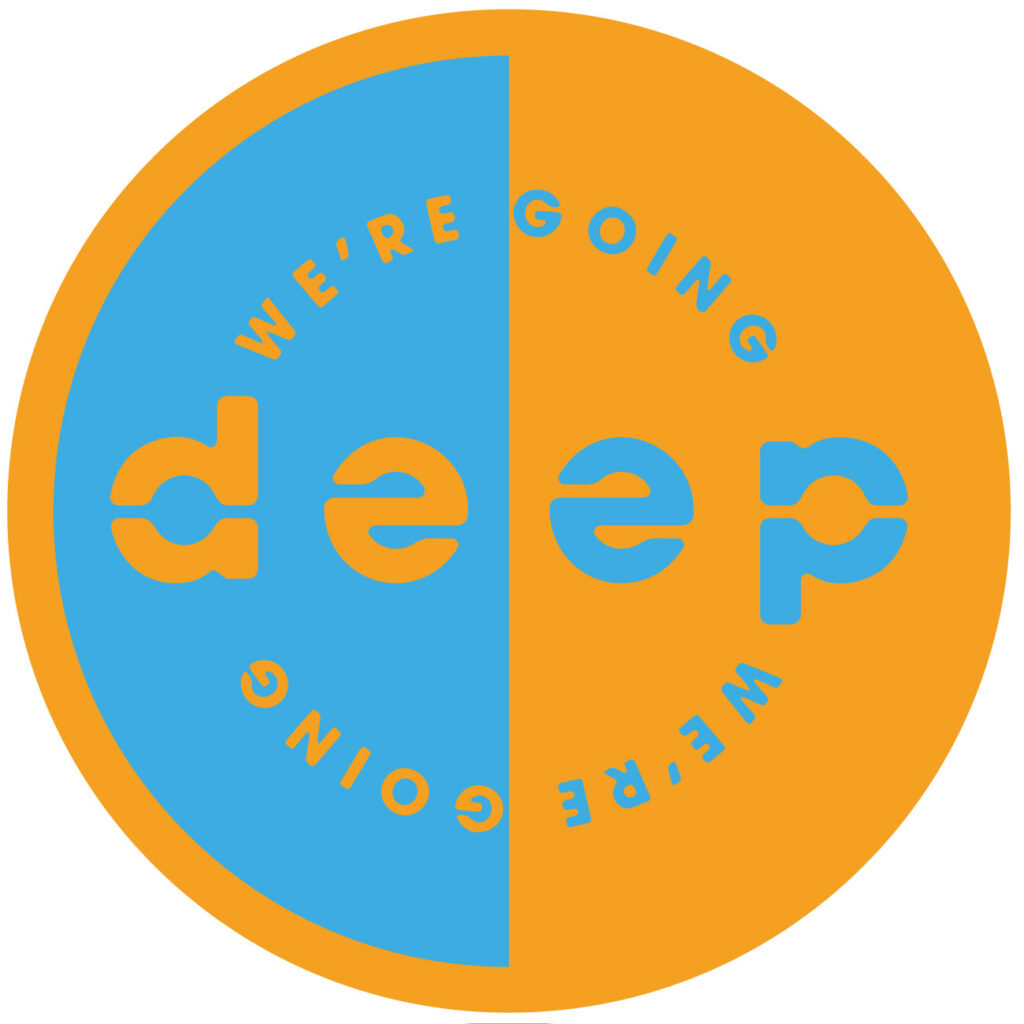
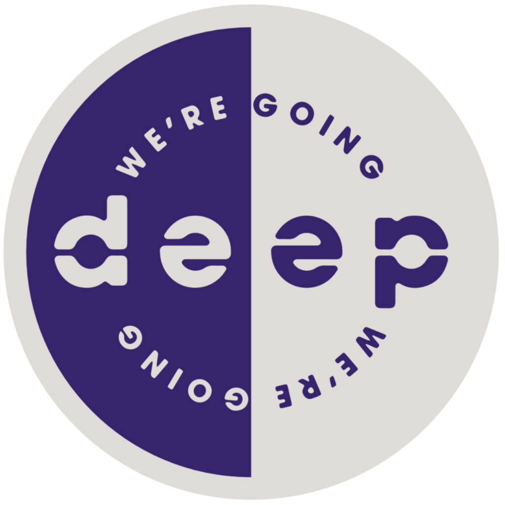
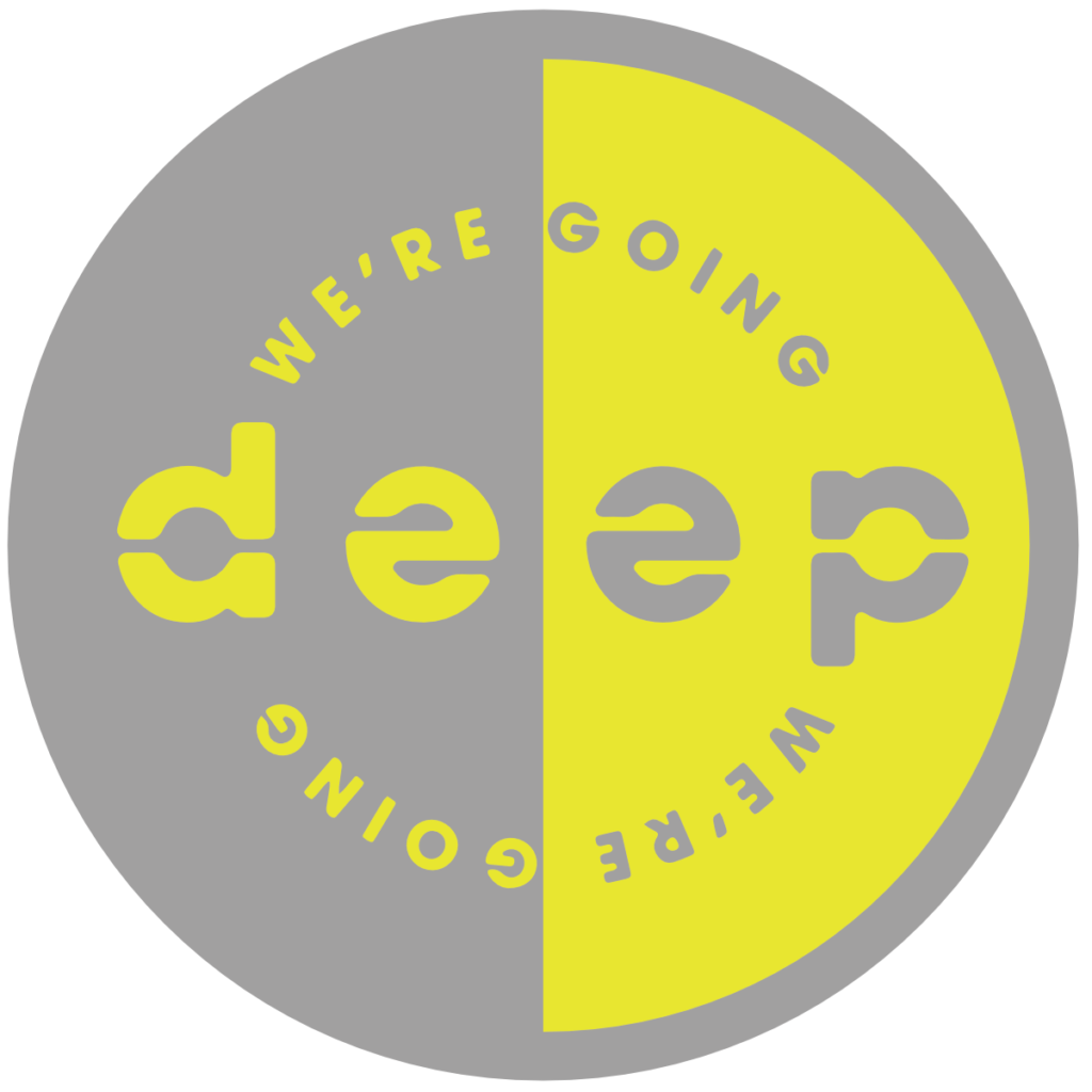
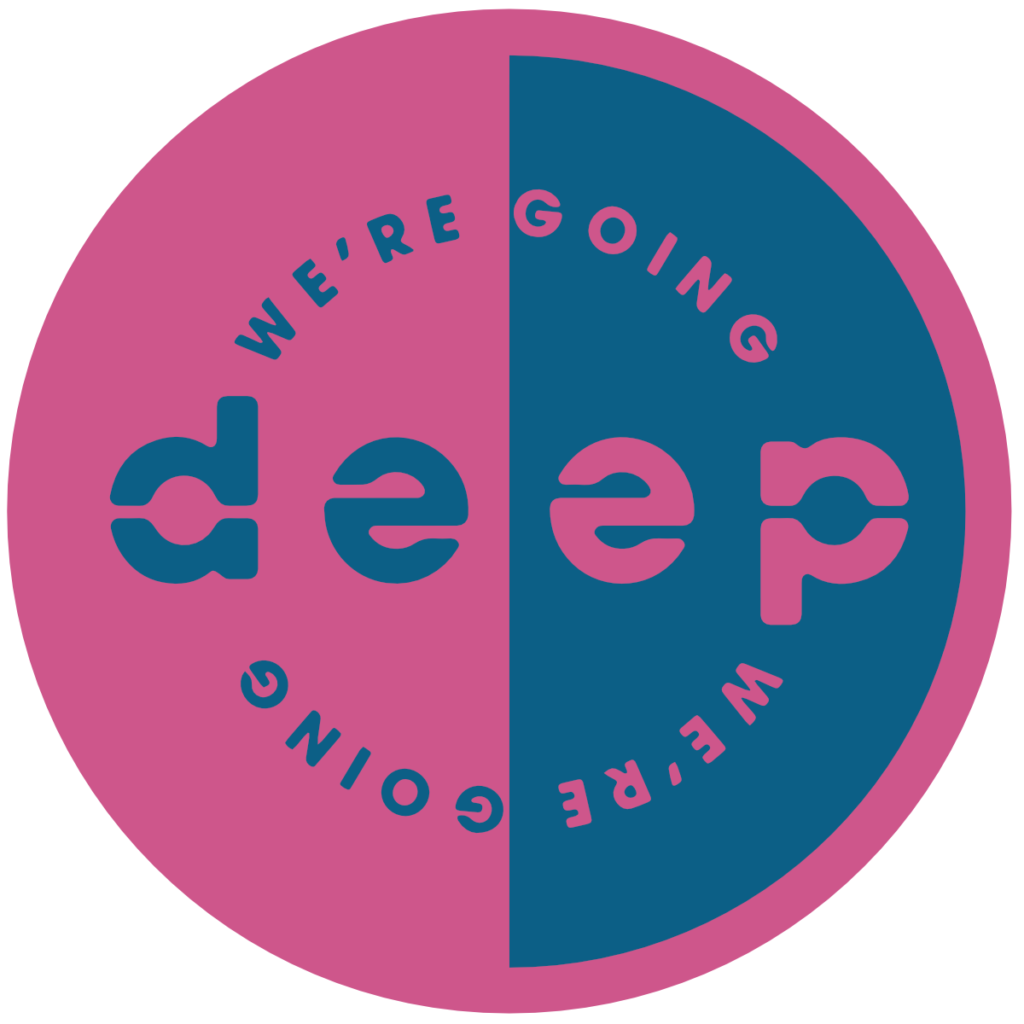
Were Going Deep 12″s


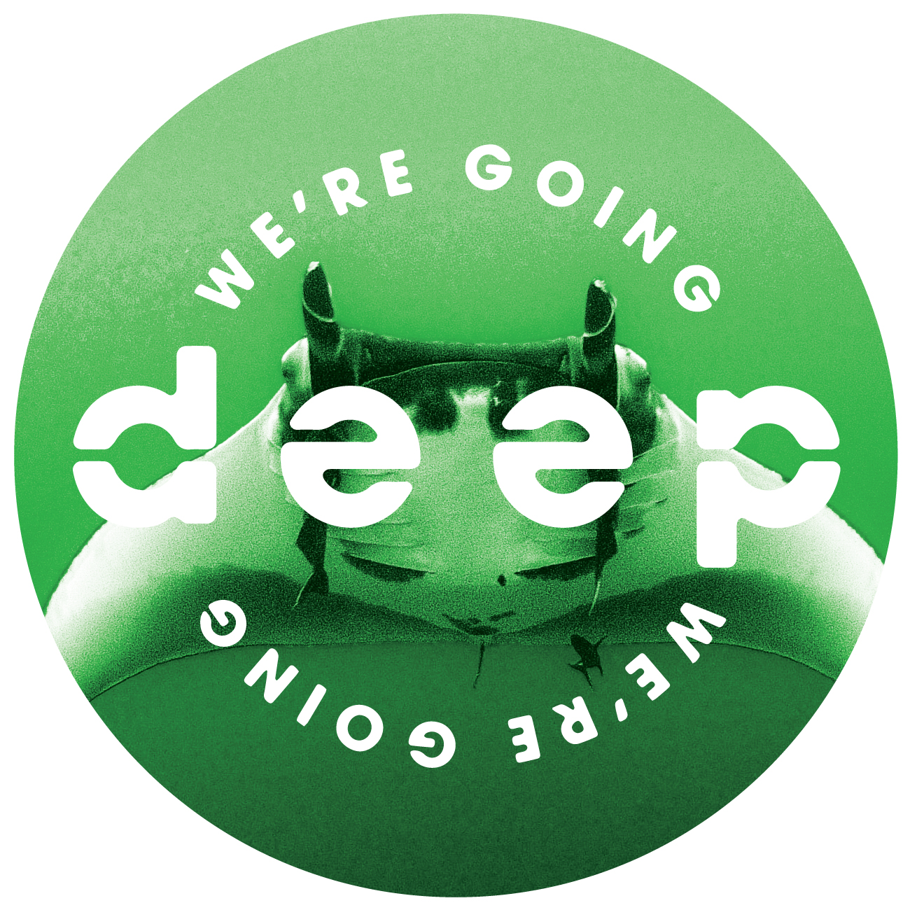
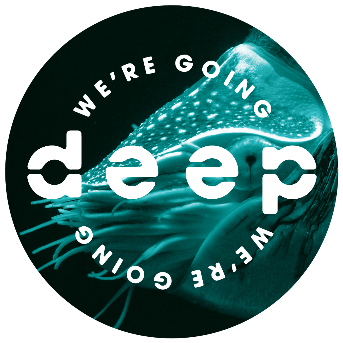
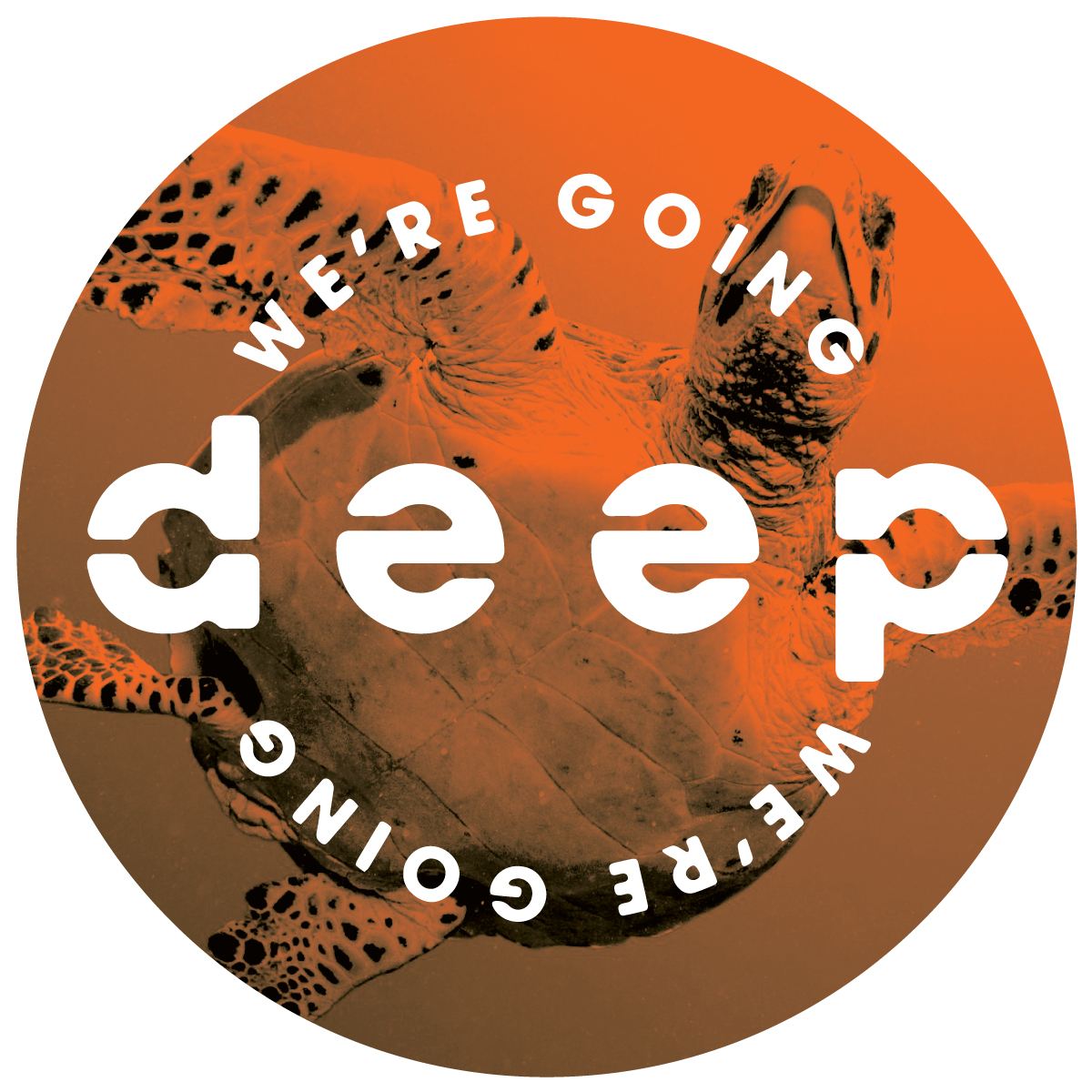
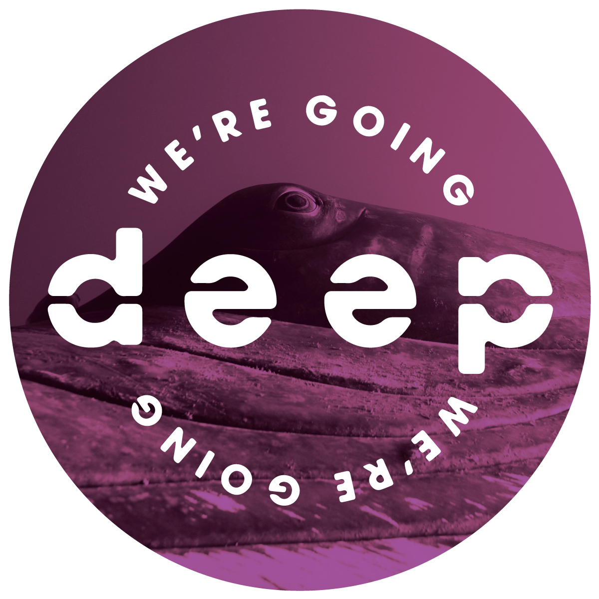
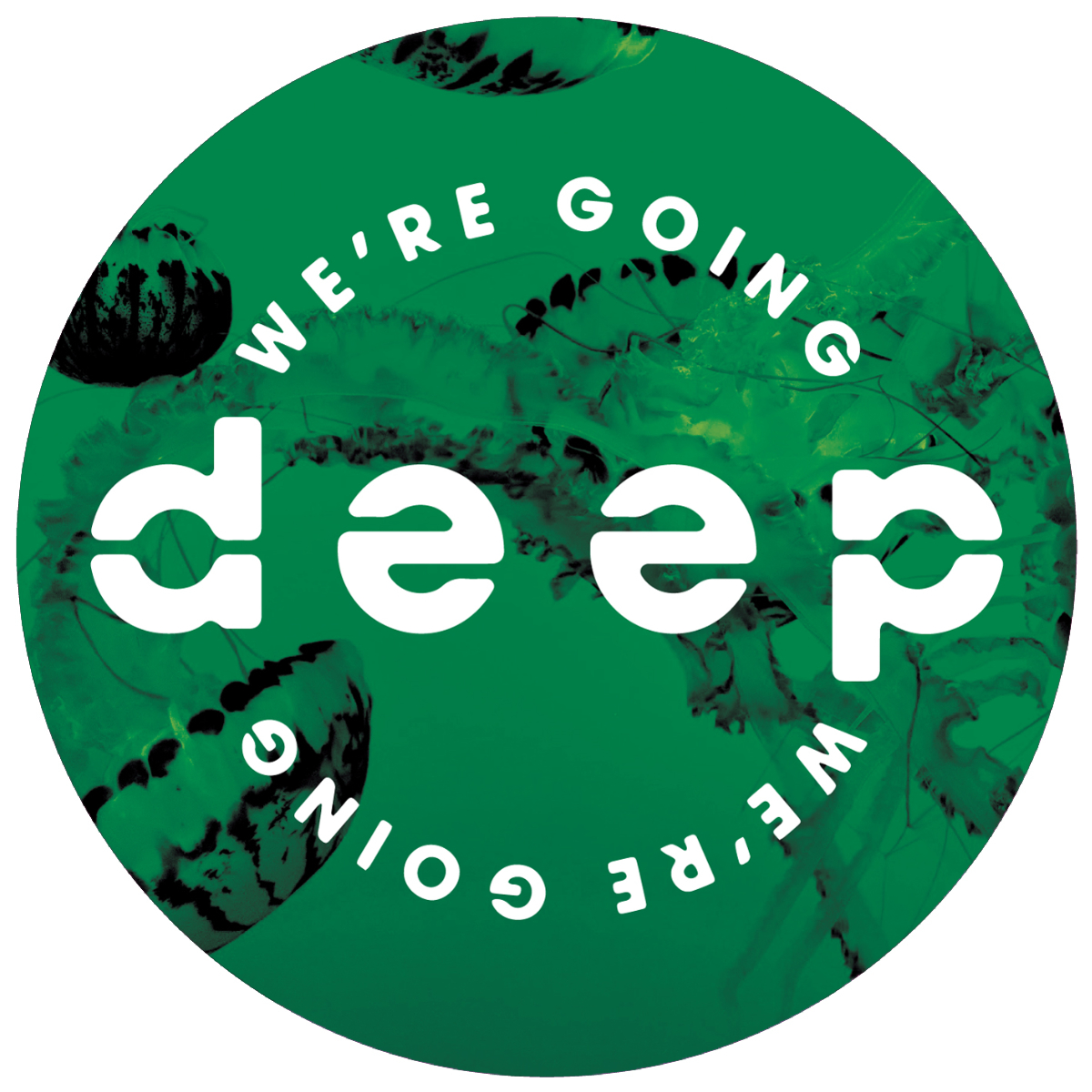
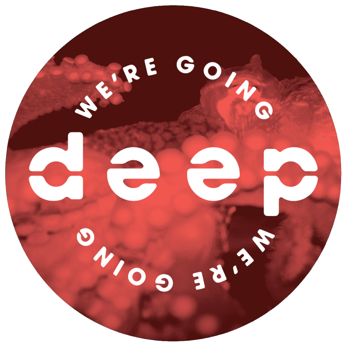
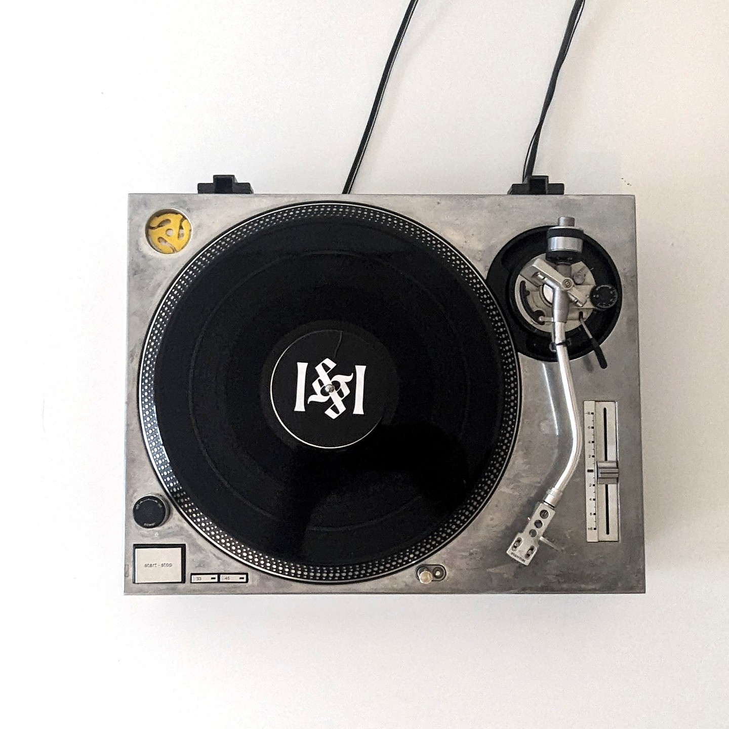
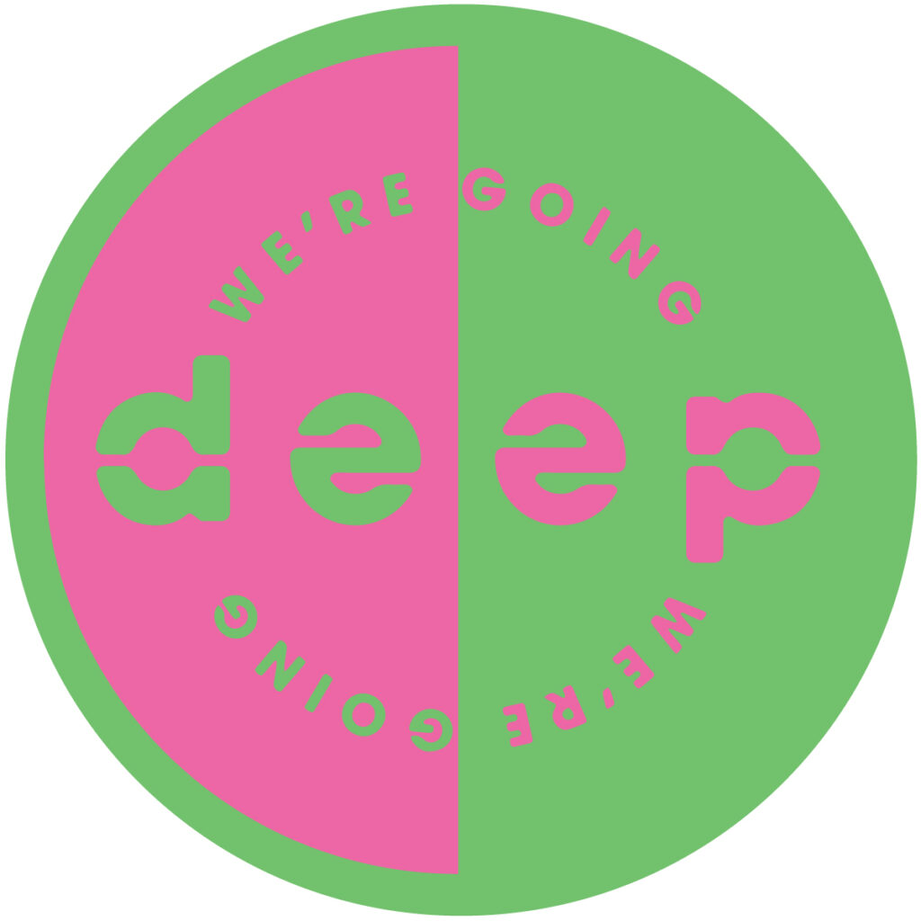
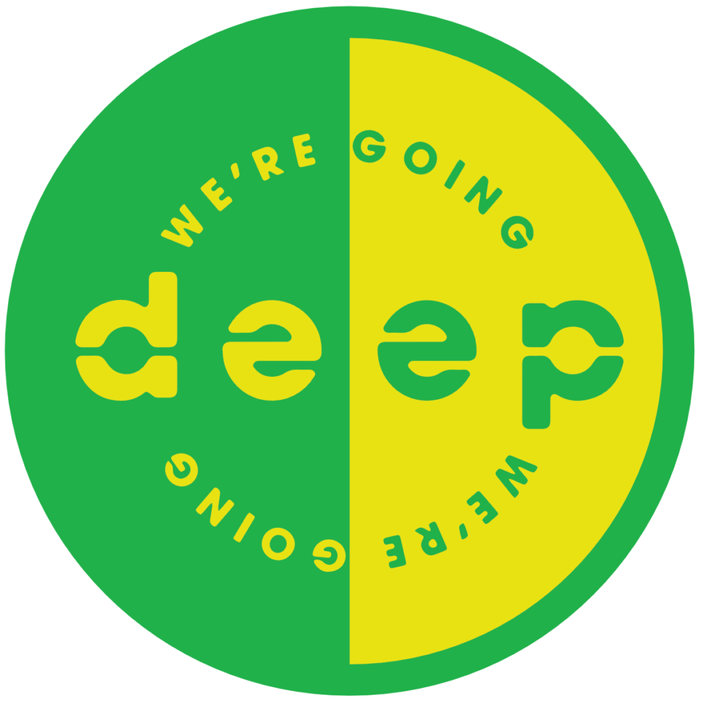
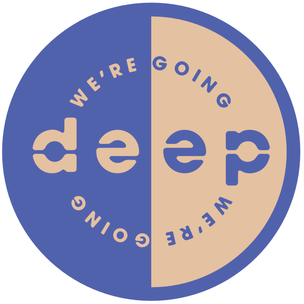
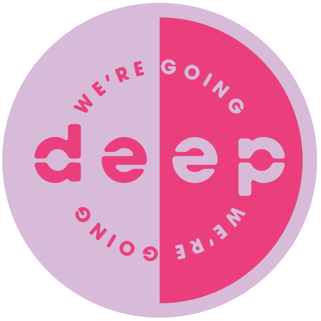
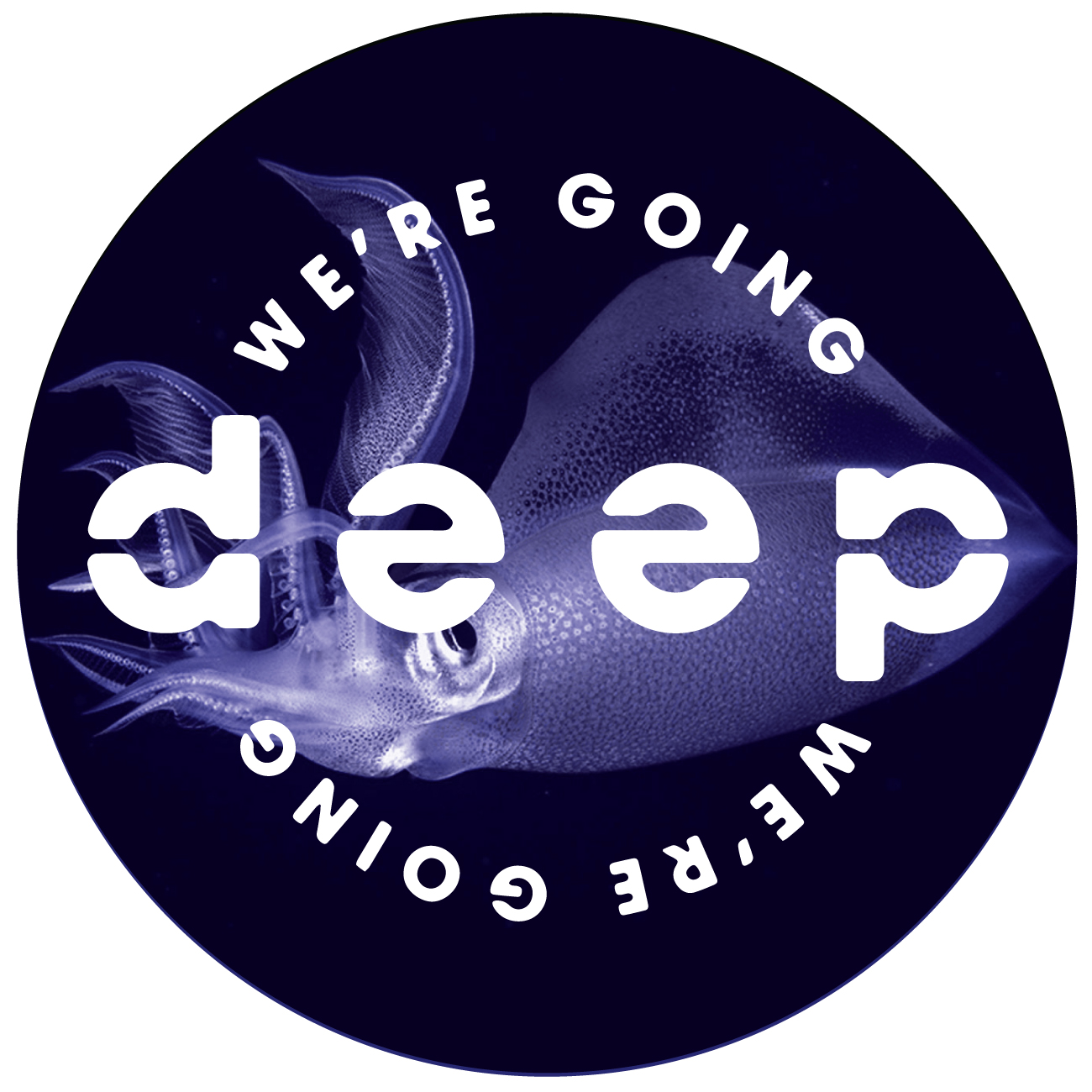
I designed the artwork for UK record label “We’re Going Deep”. WGD releases deep house and techno, primarily on vinyl. Each 12″ features tracks by a single artist. The word “deep” is rendered as an ambigram, so that it reads the same when it is rotated by 180°. When the record spins the design mirrors the hypnotic, repetitive quality of the music itself.
Read more

Quaker News

The objective of Quaker News is to allow the Quaker community to keep up with news and updates that are scattered across the multiple websites of Quaker Meetings and organizations. Quaker News pulls RSS feeds from multiple websites and combines them into a single chronological newsfeed.

You can visit at quakernews.org.

Read more

We’re Going Deep EPs


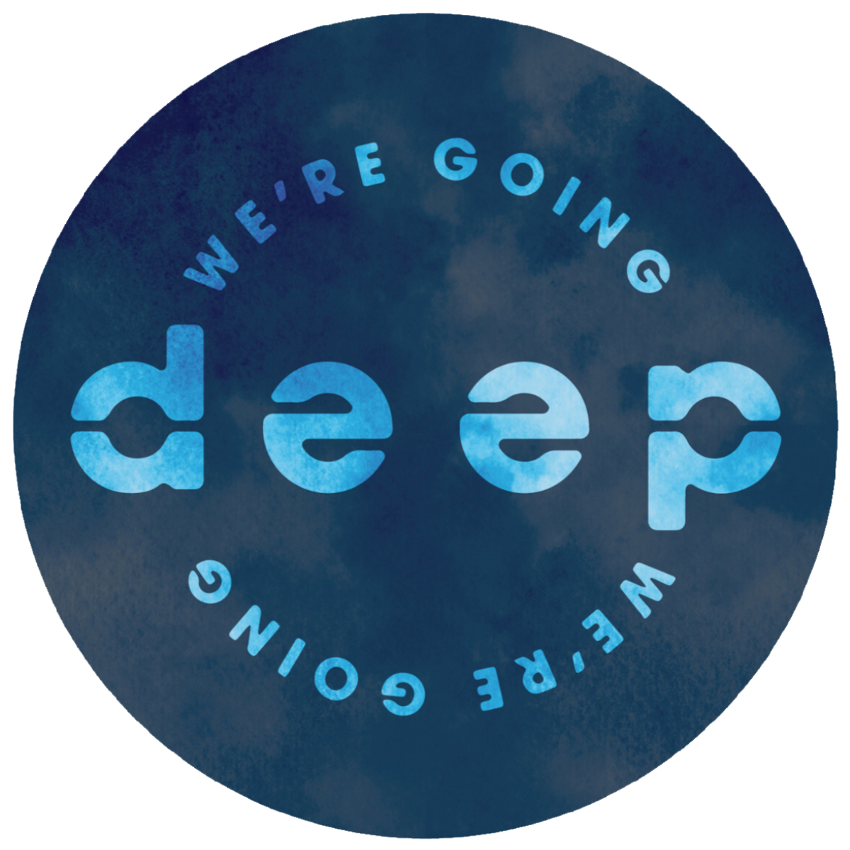
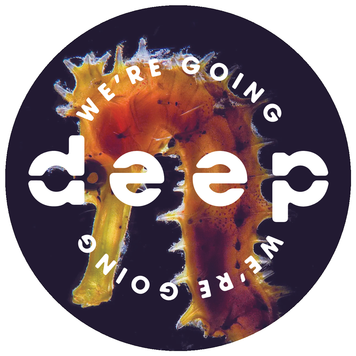
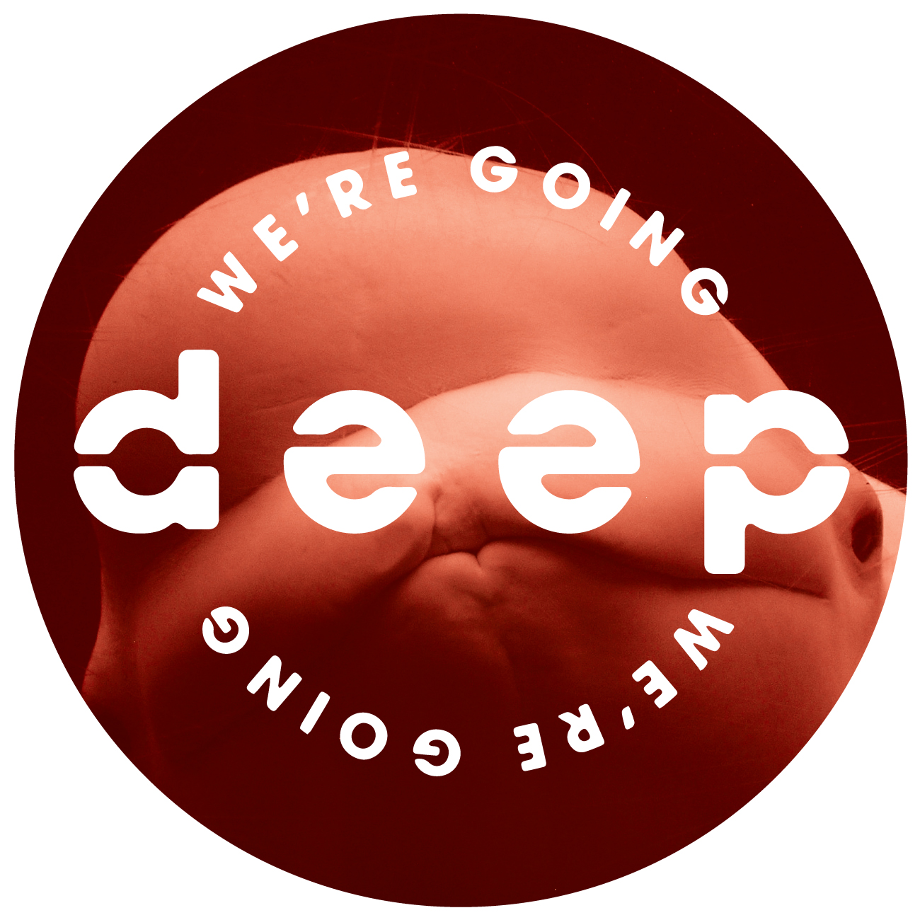
I designed the artwork for UK record label “We’re Going Deep”. WGD releases deep house and techno, primarily on vinyl. Each E.P. features tracks by multiple artists. The word “deep” is rendered as an ambigram, so that it reads the same when it is rotated by 180°. When the record spins the design mirrors the hypnotic, repetitive quality of the music itself.
Read more

I&I Ambigram

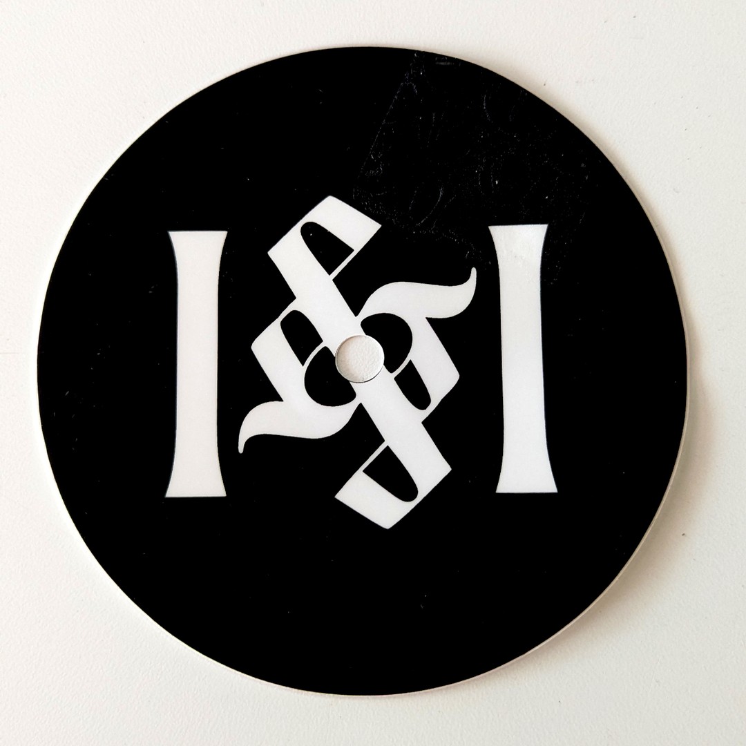
This ambigram is an experiment exploring the challenge of making an ampersand read as a rotational ambigram. The design plays on the contrast between the ornate, calligraphic nature of a traditional ampersand and the  simplicity of the letterforms on either side.

Read more

Philadelphia Yearly Meeting

Quakers love to share their stories!​ When pym.org switched to using WordPress​ as a content management system, the amount of content exploded. It became a rich resource of knowledge and information, but w​as unwieldy​ and difficult to use.

Read more

Time 4 Time

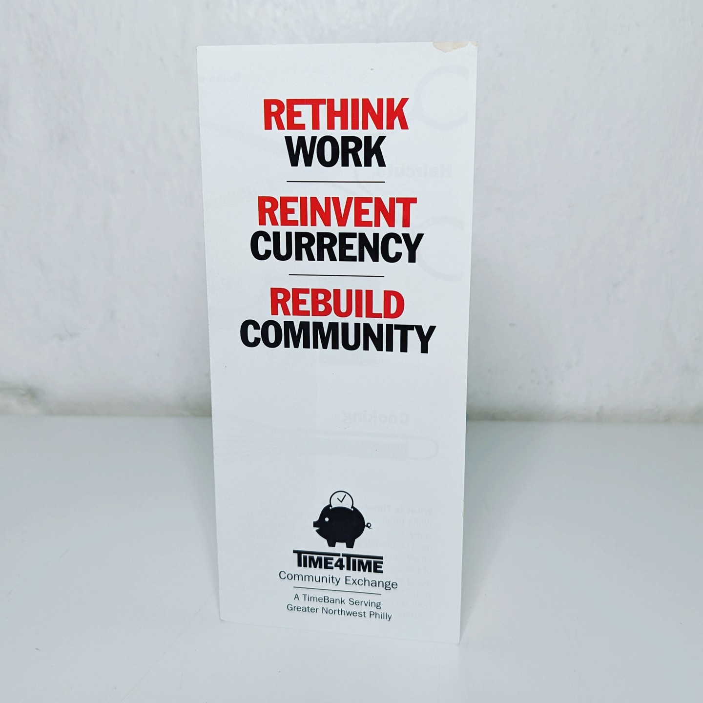
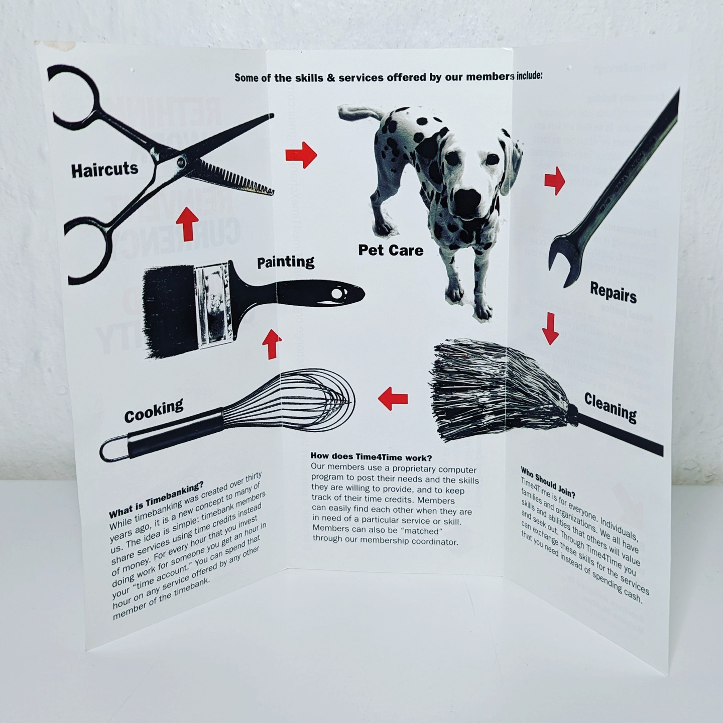
Time 4 Time is a branding and print project for a local community time bank. A platform where members trade services for services, using time as currency instead of money. The logo and brochure communicate the core idea of the time bank to a general audience, trading skill for skill, hour for hour, without relying on financial jargon.

MoMusic

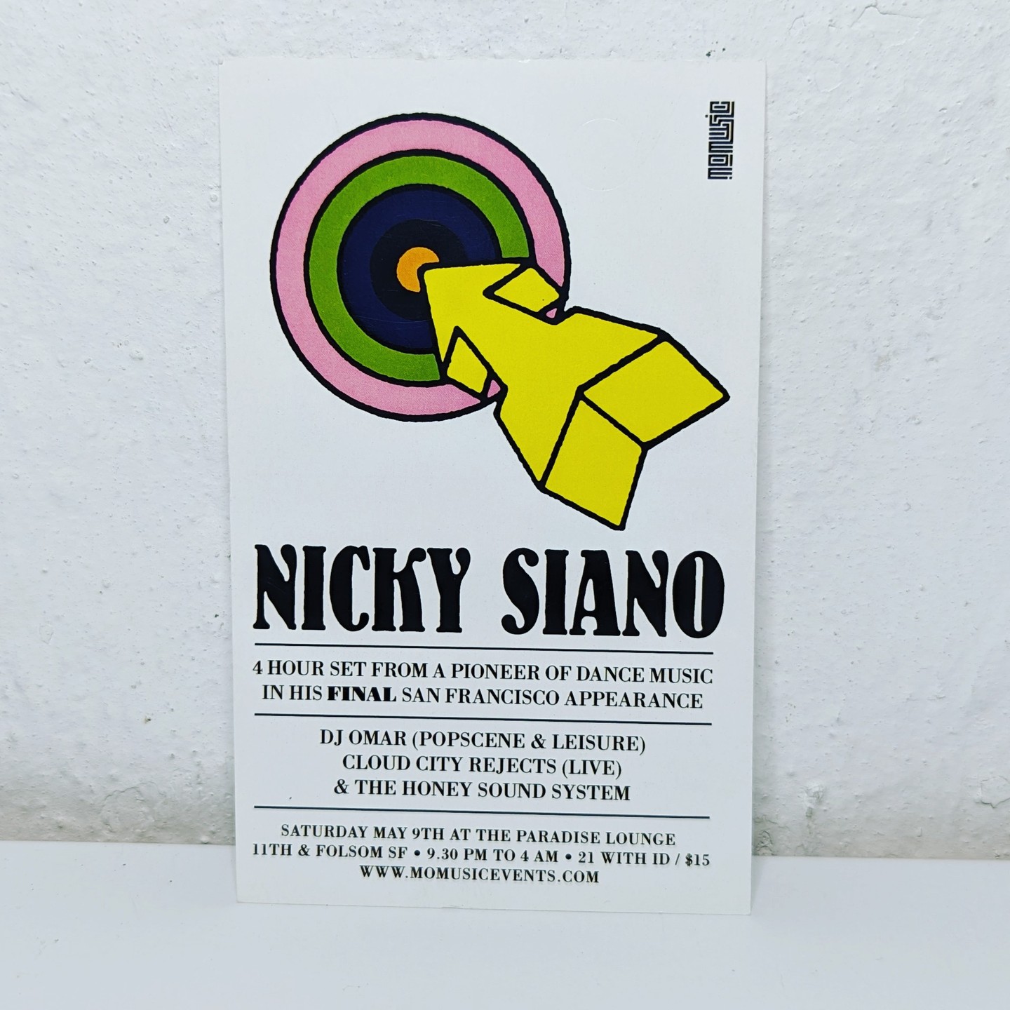
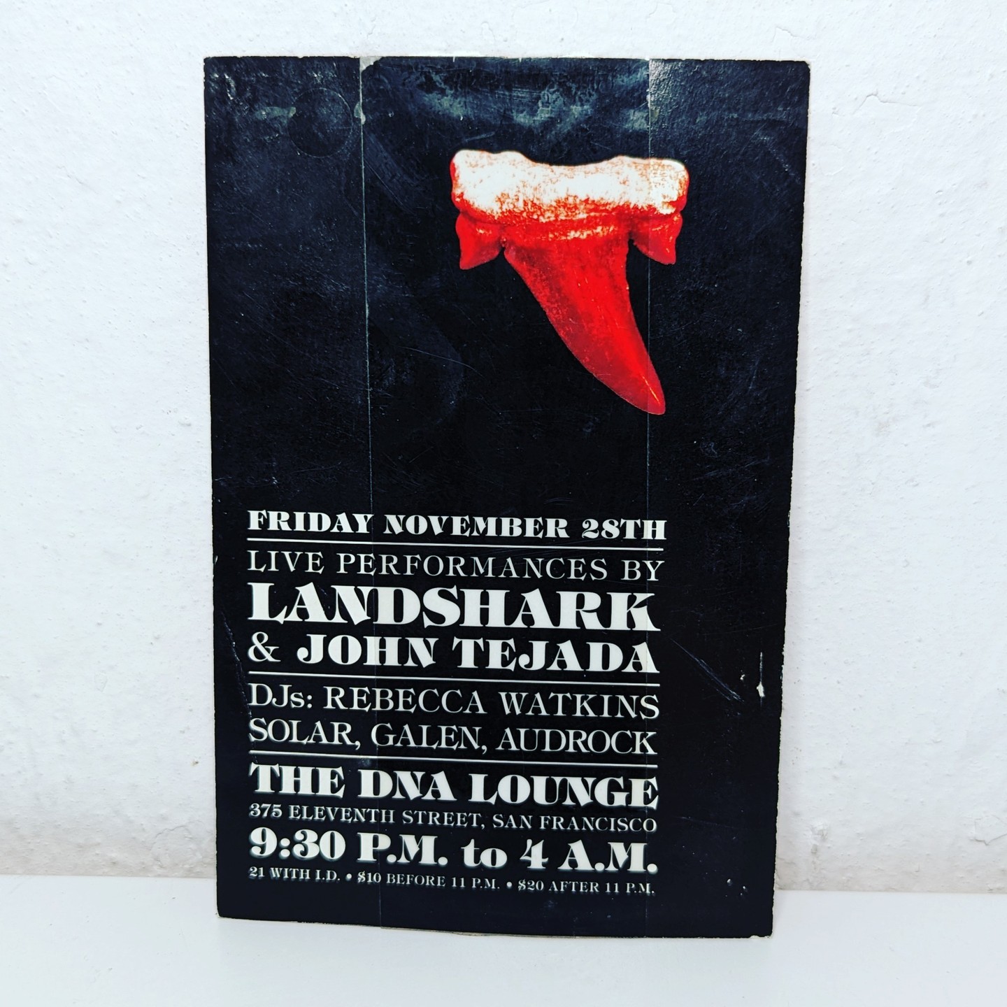
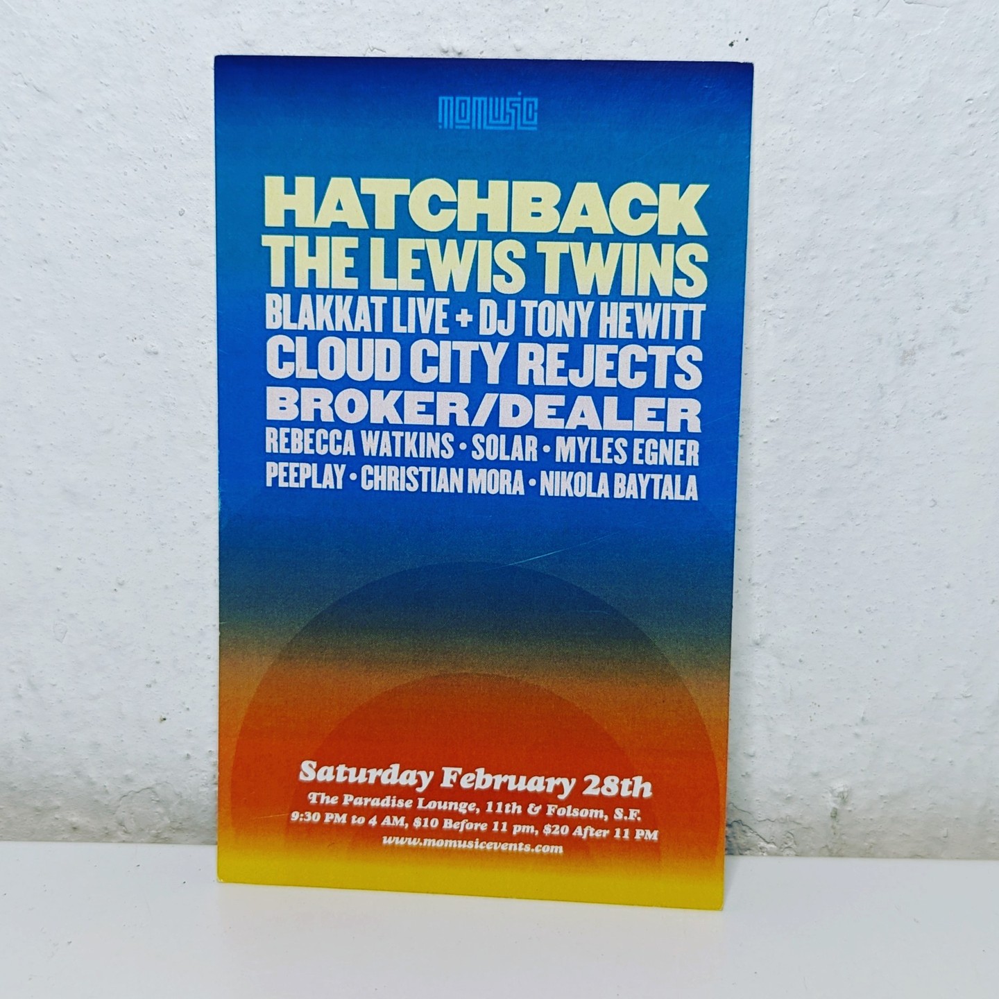
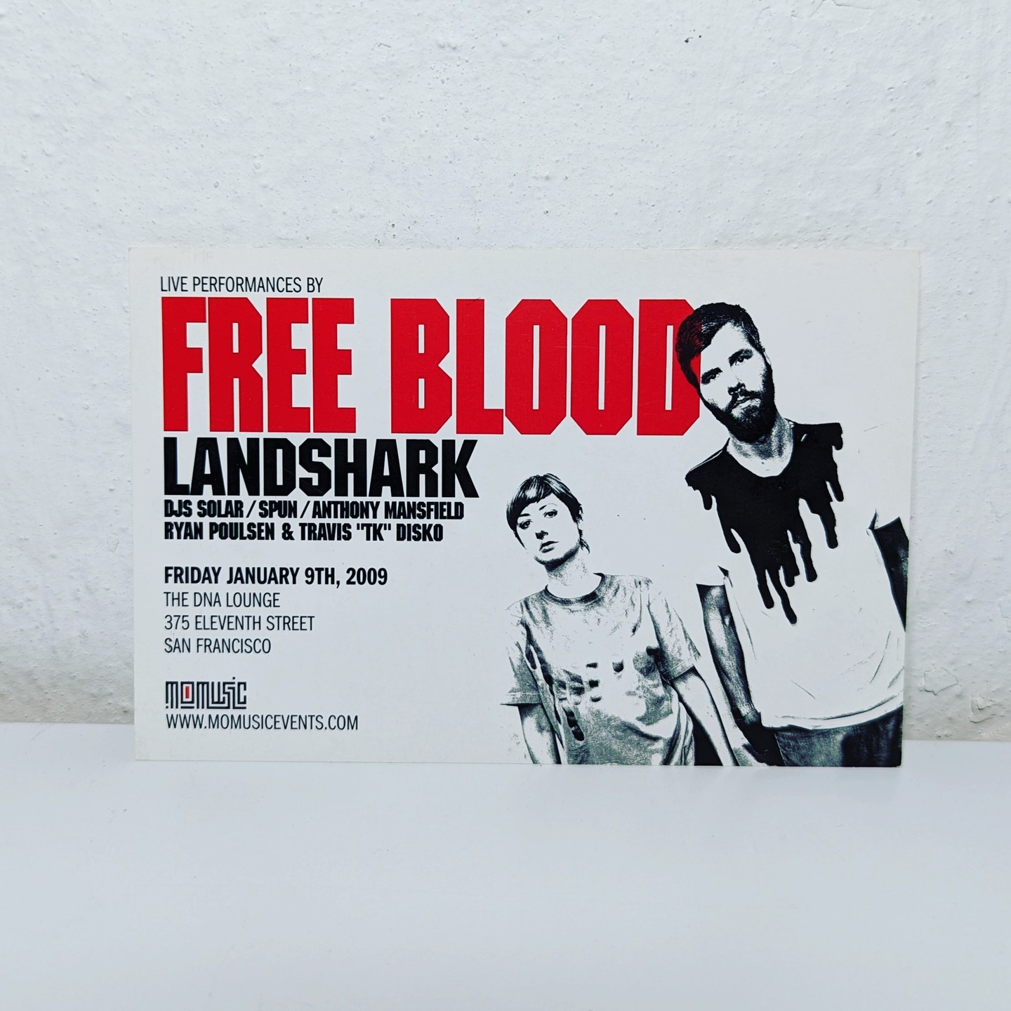
I designed a series of event fliers for Mo Music, a San Francisco based music event production company specializing in dance and electronic music. Trying to step away from what had, at the time, become a very clichéd design style that was specific to the “rave” scene, and to also convey the individual energy and feel of the artists and their music.

Freedom Fuels

Freedom Fuels Flier

Freedom Fuels is a flier for the San Francisco premiere of a documentary about plant-based, renewable fuel sources. The design uses illustration and typography to carry the film’s message. The MoFilms logo in the corner is a quiet visual pun on the Mobil Oil logo.

The Freedom Fuels documentary is still available to watch online

Weavers Way Co-op

Weavers Way Co-op is a member-owned grocery cooperative based in Philadelphia, PA. I designed and built a web-based membership management system that allows members and staff to track work shifts, payments, receipts, etc.

My role included all visual design and front-end development (built on top of the co-op’s existing PERL stack) building an interface that feels consistent with Weavers Way’s public-facing website while serving the practical needs of a membership portal.

The system has been in active use since 2016.